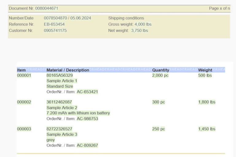
3 x 3 tips for using the Designer efficiently
The Cartago®Live Designer is the heart of document management via Cartago®Live and also the central template management system in the company.
Thanks to fixed and variable content in the templates, the individual departments can easily design CI-compliant templates themselves. Fast and error-free. Designing CI-compliant templates for business processes has never been so easy!
This makes our Designer a powerful tool, but how do you use it efficiently? Here are some tips to help you get the most out of your document templates.
Tip 1: How to place building blocks precisely
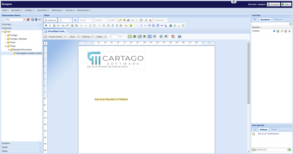
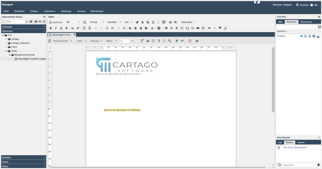
In our Designer, we offer two practical ways to insert building blocks into your documents: as an “external section” and directly in the body text.
But what does this actually mean and how does it work?
a) External section – place freely within the page margin
Imagine you want to place a module, such as a text field or image, exactly where it fits best on your page, without worrying about the body text.
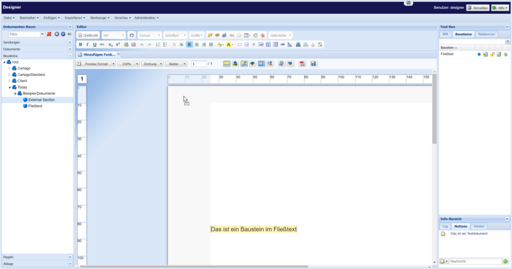
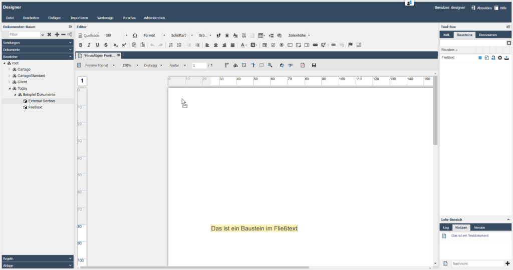
This is where the “External Section” comes into play. With this function, the module is inserted within the page margin using drag-and-drop:
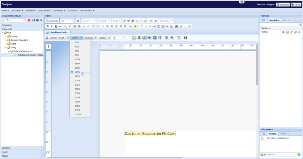
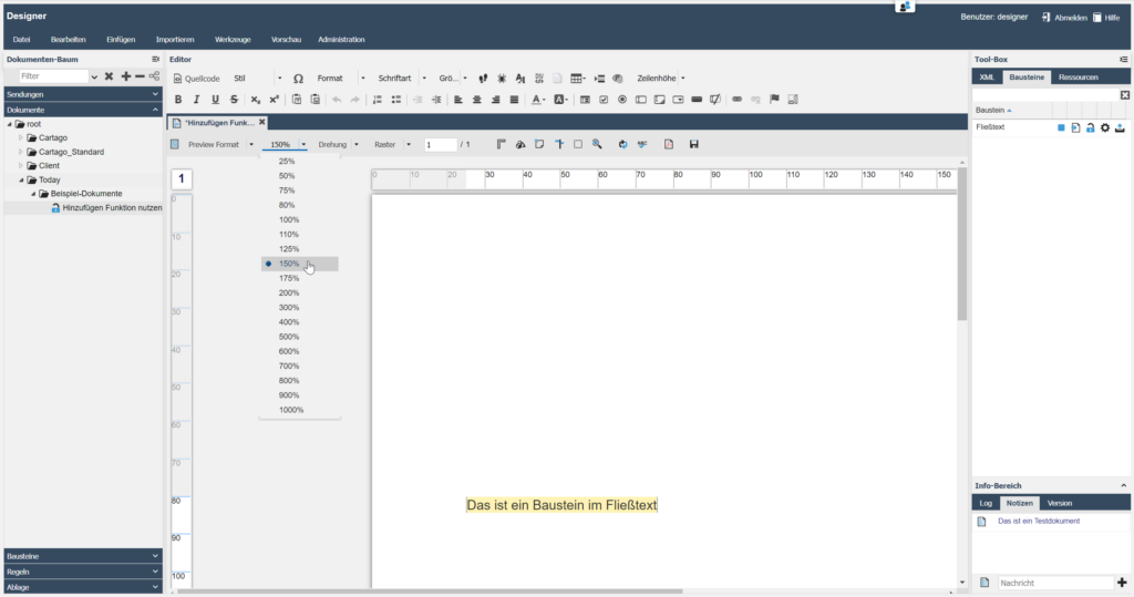
IWe recommend using the zoom function of our designer. This ensures that your module is placed perfectly within the page margin.
b) Building block in running text – precise and controlled
Sometimes you want to insert a block directly into your running continuous text.
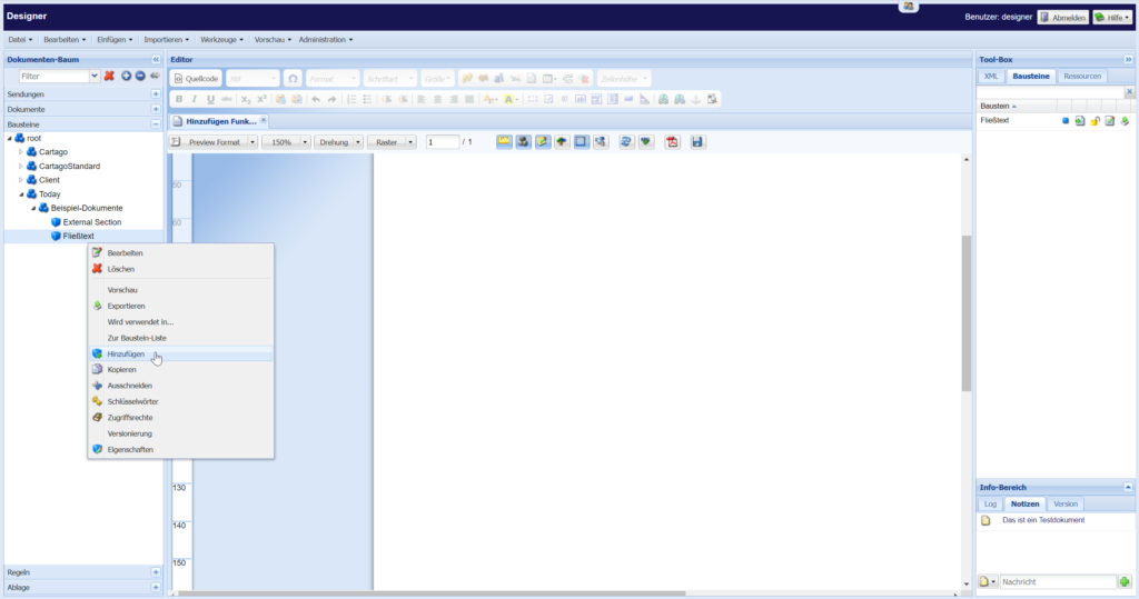
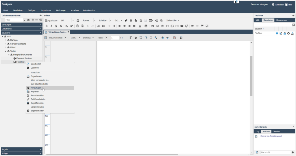
Although the drag-and-drop principle also works here, we recommend that you right-click on the desired block instead and place it using the “Add” button.
Why? This method gives you more control and ensures that the block ends up exactly where you need it – without the risk of accidentally inserting it as an “External Section” outside your desired text area.
Why is this important?
By using these functions, you avoid errors that could result from inaccurate placement and ensure a professional layout for your documents.
Tip 2: How to find everything faster with the link-to-focussed-document-feature
When working with document templates and elements on a daily basis, it can easily become confusing.
Especially when you are working with a large number of documents, modules, rules or conditions, it is important to find what you need quickly.
This is where a small but effective tool comes into play: the link to focussed document feature.
This tip shows you how you can save time and increase your efficiency.
How to use the link to focussed document feature
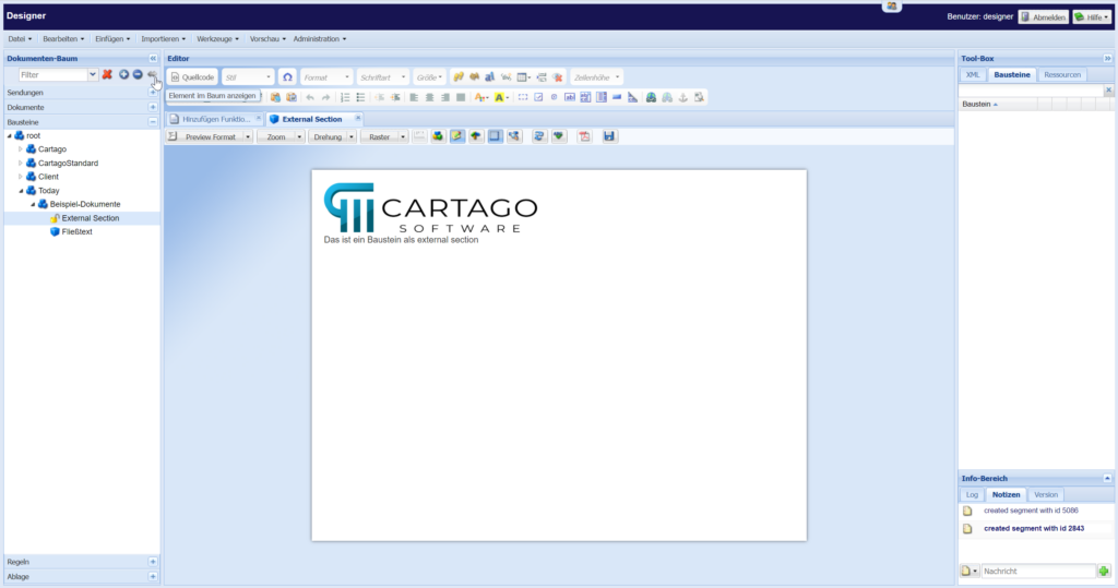
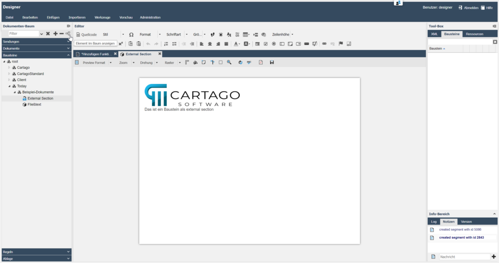
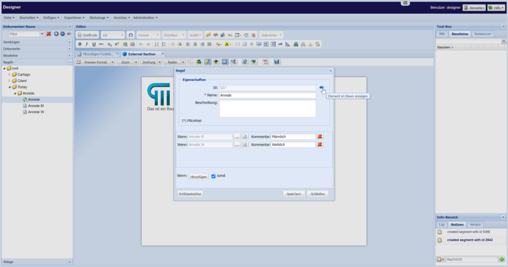
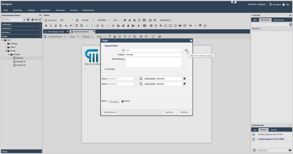
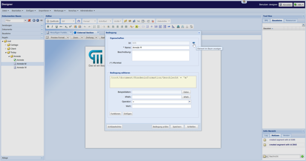
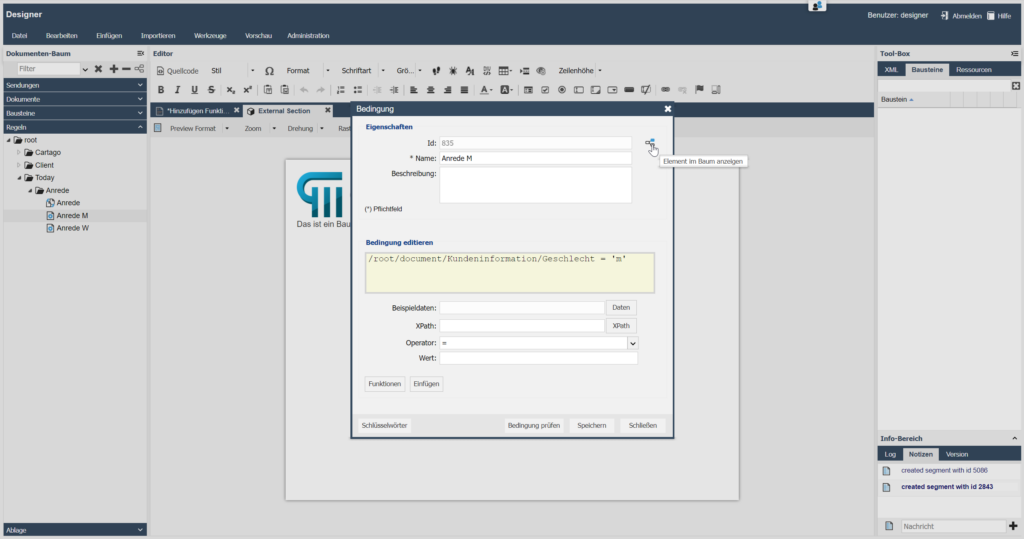
If you have just opened a document or a module and want to quickly jump to this element in the structure tree of your document management system, the double arrow/element tree provides a direct link.
Click on this symbol next to the open element and voilà – the system takes you directly to the where the element is in the tree.
This saves you time and eliminates the need for long searches.
Activating and deactivating the feature
To activate the function, simply click on the double arrow / element tree next to the open element. If you no longer need the direct link, you can simply deactivate the function by clicking the button again.
Also for rules and conditions
This quick access via the double arrow / element tree is also available for rules, conditions, and similar elements in your document management. Regardless of where you are currently working, one click is all it takes to jump directly to the desired point in the tree./
link to focussed document feature in rules
link to focussed documentfeature in conditions
Why is this important?
This feature is a real time saver, especially in complex document structures. It helps you to maintain an overview, improves navigation and makes working in the document management system much more efficient.
Try it out and see for yourself how much faster you can achieve your goals with the double arrow feature.
Tip 3: How to communicate more efficiently with the note function
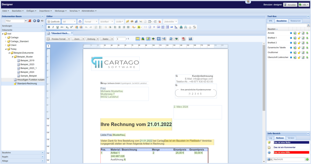
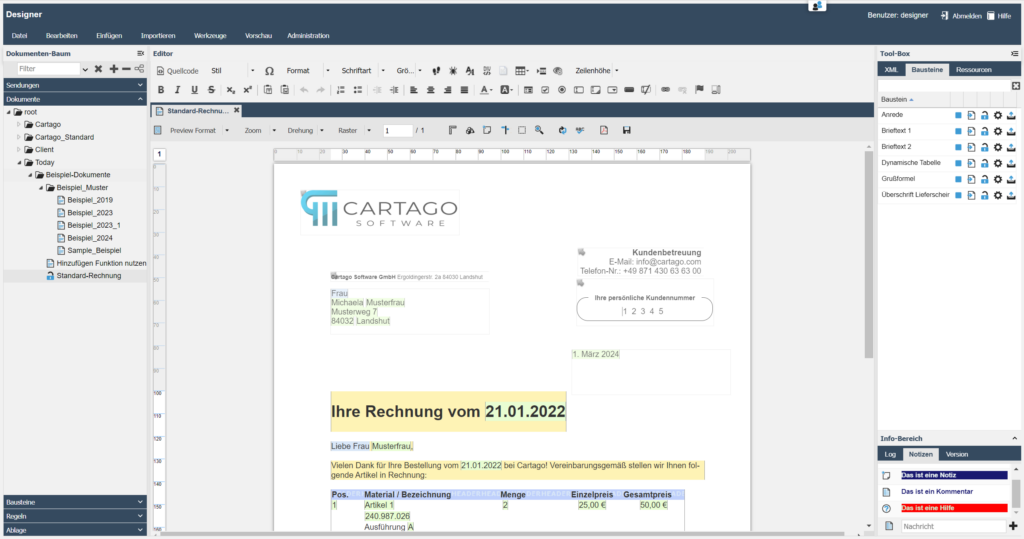
When you are working on a document as a team, clear communication is crucial. This is exactly what the note function in the notification area of our Designer is designed for – a practical function located in the bottom right-hand corner of the screen. It facilitates collaboration because the note function provides valuable information directly in the work context. Let us see how you can make the most of this function.
Maximum overview through colors
In the latest versions of our Designer, you have the option of individually configuring the colors for the different note types. This allows for even quicker visual differentiation and helps you to maintain an overview.
Whether it is a reminder for a vacation replacement, a call for help to a colleague or a comment function to provide feedback – the right color scheme makes it easy to immediately recognize what it’s about.
Editing and managing notes
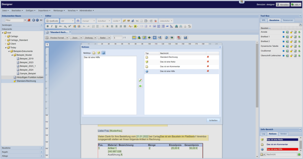
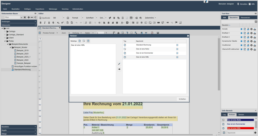
Would you like to edit an existing note or delete entries you no longer need? No problem! Double-click on the relevant note to open a larger dialog in which you can edit or remove your entries. This always keeps your communication up-to-date and relevant.
Why you should use the notes function
The notes function in Designer is more than just a simple tool for entering text. It is a central interface for communication and information within your projects.
By making targeted use of this function, you can improve team collaboration, avoid misunderstandings, and ensure that it is always clear who must do what and by when.
Cartago®Live DesignerDocument management may seem complex at first glance, but with these tips you should find it easier to organize your documents efficiently and effectively. Try it out and see for yourself how a good template design with Cartago’s Designer can make your work easier!
If you have any questions about these topics or would like more information, please call us on +49 871 430 63 63 00 or send an email to info@cartago.com.


